Ecommerce web design in 2026 is not about chasing the flashiest effect. It is about blending fresh visual ideas with the fundamentals that still decide sales: speed, mobile experience and a frictionless path to checkout. The stores winning this year adopt trends selectively, using new design ideas to boost conversion rather than distract from it. Here are the ecommerce web design trends shaping online stores now, why each matters, how to apply it, and which ones are worth your budget first.
Trends at a glance: AI personalisation, mobile-first “thumb-zone” design, bento grid layouts, micro-interactions, scroll-driven storytelling, immersive AR shopping, minimalist conversion-focused layouts, bold typography, frictionless checkout, social commerce, AI-powered search, and sustainable, SEO-ready design. Prioritise the ones that lift conversion; treat the purely visual ones as accents.
What are ecommerce web design trends?
Ecommerce web design trends are the evolving patterns in how online stores look, feel and function. In 2026 they sit at the intersection of aesthetics and performance: a trend is only worth adopting if it makes the store easier, faster or more persuasive to buy from. The rest is decoration.
The 12 ecommerce web design trends for 2026
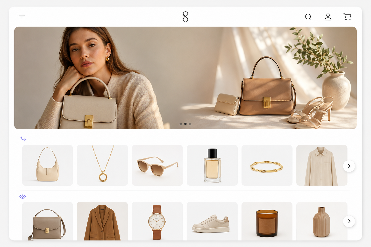
1. AI-powered personalisation
What it is: Stores that adapt in real time, changing homepage banners, product recommendations and messaging based on behaviour, location and intent.
Why it matters: Relevant experiences convert better than one-size-fits-all pages.
How to apply: Start with recommended and recently viewed products, then personalise landing pages for your highest-value segments.
2. Mobile-first and “thumb-zone” design
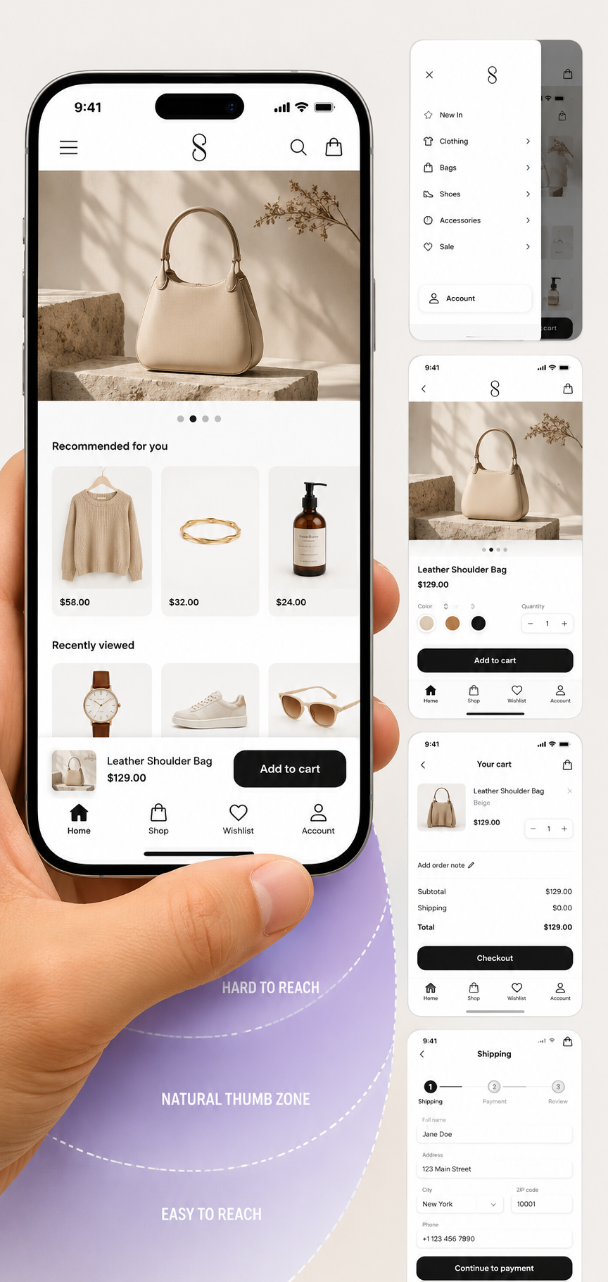
What it is: Designing for the phone first, with sticky navigation, swipe gestures and key actions placed where a thumb naturally reaches.
Why it matters: The majority of ecommerce traffic is now mobile, so a store that works one-handed simply sells more.
How to apply: Put add-to-cart and checkout buttons in the lower thumb zone, keep tap targets large, and test the full flow on a real phone.
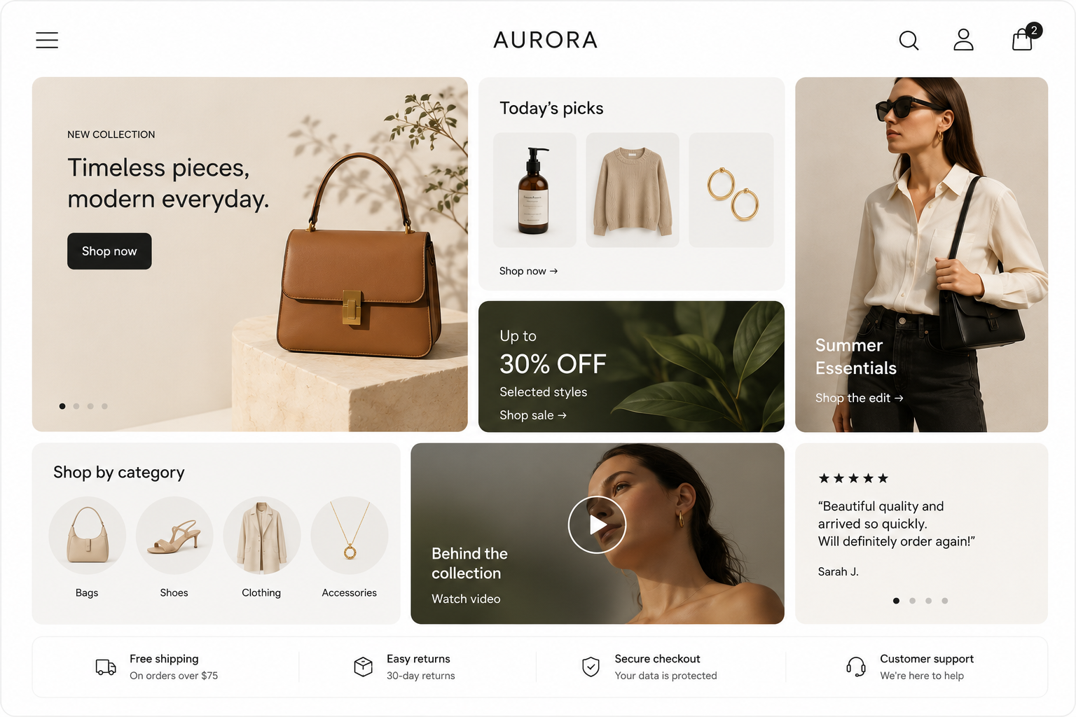
3. Bento grid layouts
What it is: A modular, box-based layout inspired by tech dashboards that shows different content types, video, banners, products, in one organised view.
Why it matters: It packs more into a single screen without feeling cluttered, and it looks modern and premium.
How to apply: Use a bento grid on the homepage or a category landing page to feature collections, offers and social proof together.
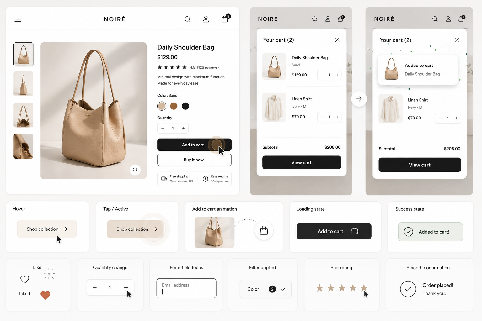
4. Micro-interactions and subtle animation
What it is: Small feedback moments, a button that responds on hover, a satisfying add-to-cart animation, a smooth confirmation.
Why it matters: These cues reduce friction and quietly build trust, making the store feel responsive and alive.
How to apply: Add restrained animation to key actions, but keep it fast and never let it slow the page.
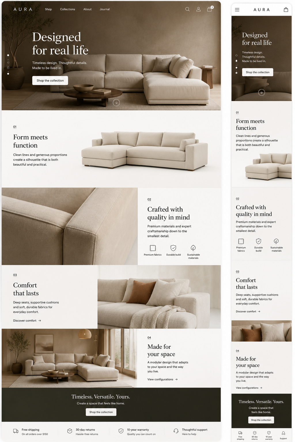
5. Scroll-driven storytelling and product reveals
What it is: Pages that unfold as you scroll, revealing product details, features and lifestyle imagery in sequence.
Why it matters: For considered or premium products, storytelling holds attention and sells the value, not just the price.
How to apply: Use it on hero and flagship product pages. Keep transactional pages fast and simple.
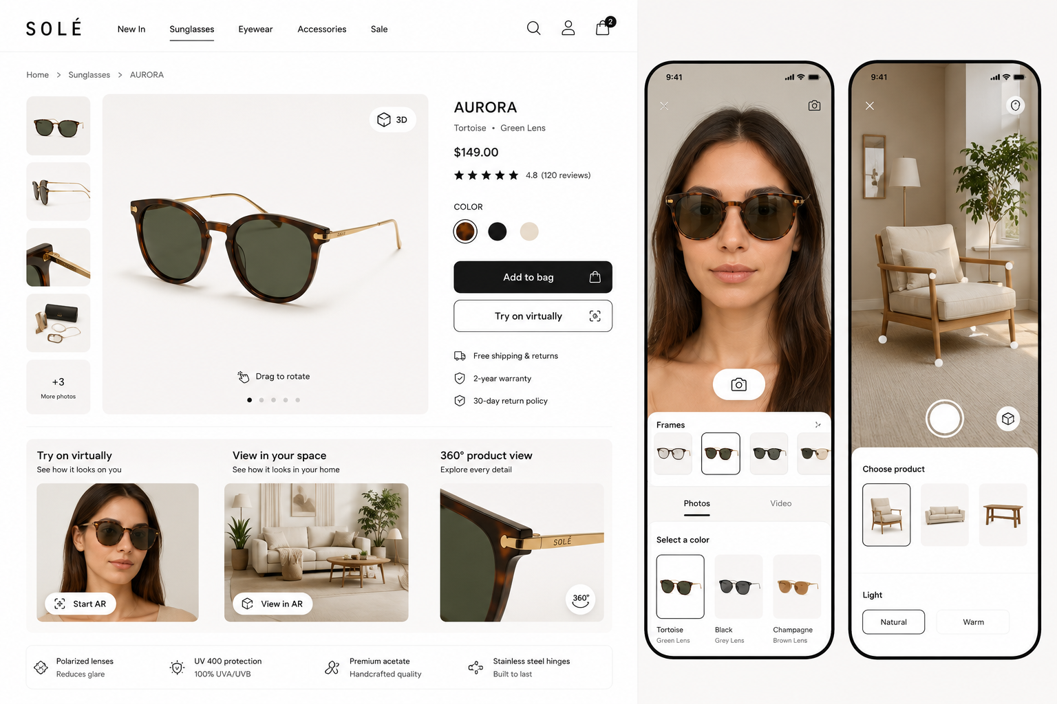
6. Immersive shopping: AR and 3D
What it is: Virtual try-ons and 3D product views that let shoppers see items in context. Beauty brands like Sephora popularised AR makeup try-ons.
Why it matters: Seeing a product in your space or on yourself reduces uncertainty and returns.
How to apply: Prioritise AR and 3D for categories where fit and look drive the decision, such as furniture, eyewear, fashion and cosmetics.
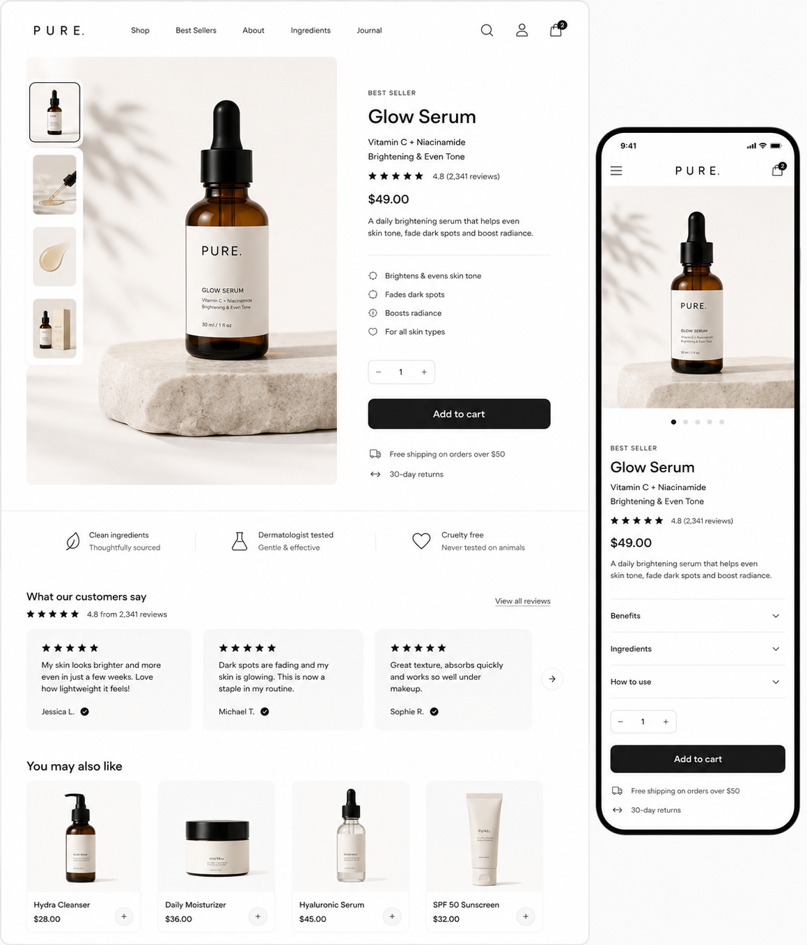
7. Minimalist, conversion-focused layouts
What it is: Clean layouts with generous whitespace that put the product front and centre.
Why it matters: Less clutter means clearer decisions and a more premium feel.
How to apply: Strip each page to one primary action, and remove anything that does not help the shopper buy.
8. Bold typography and distinctive aesthetics
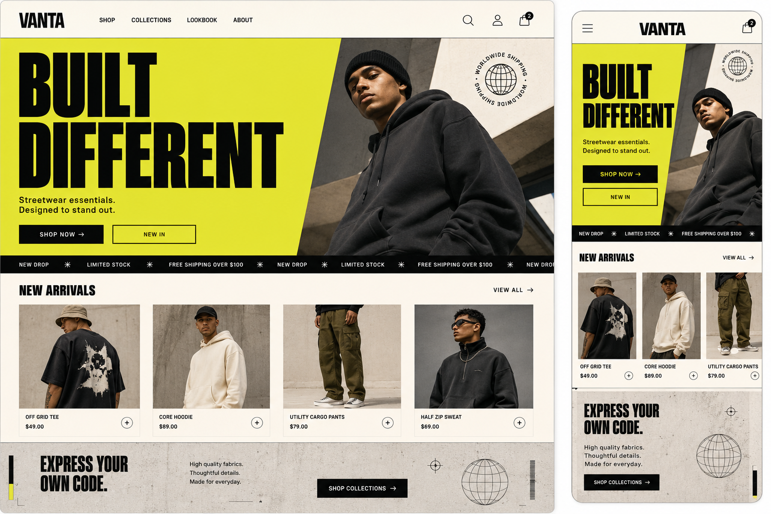
What it is: Larger, chunkier fonts and confident visual styles, including neo-brutalist and retro-inspired looks, used to stand out.
Why it matters: In a sea of similar stores, a distinctive visual voice builds brand recognition.
How to apply: Use bold type for hero statements and brand moments, while keeping product and checkout pages clean and legible.
9. Frictionless checkout and flexible payments
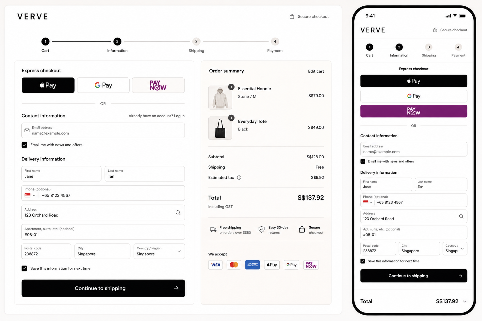
What it is: Short, guest-friendly checkouts with express options and digital wallets like Apple Pay, Google Pay and PayNow.
Why it matters: Checkout is where carts are won or lost, and every extra step leaks sales.
How to apply: Offer guest checkout, autofill, a progress indicator and local payment methods, and cut fields to the minimum.
10. Social commerce integration
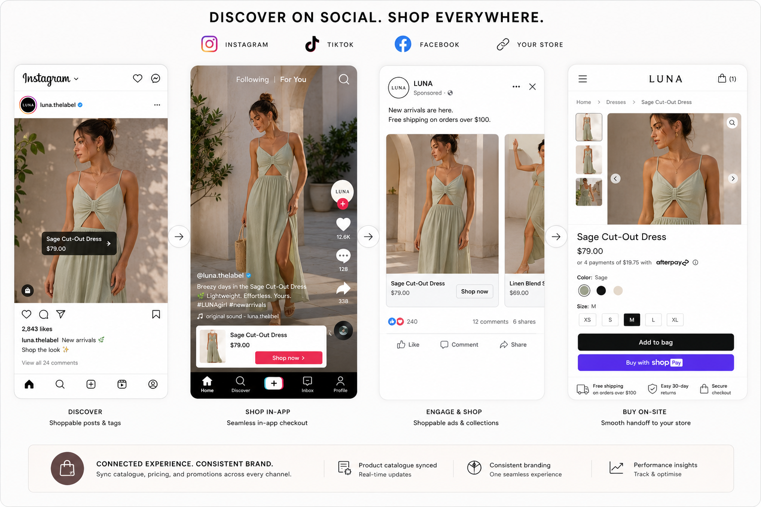
What it is: Shoppable content and connected storefronts across TikTok, Instagram and Facebook, with discovery on social and a smooth handoff to purchase.
Why it matters: More shoppers discover and buy inside social apps, so your store needs to meet them there.
How to apply: Sync your catalogue, add shoppable tags, and keep branding and pricing consistent between social and your site.
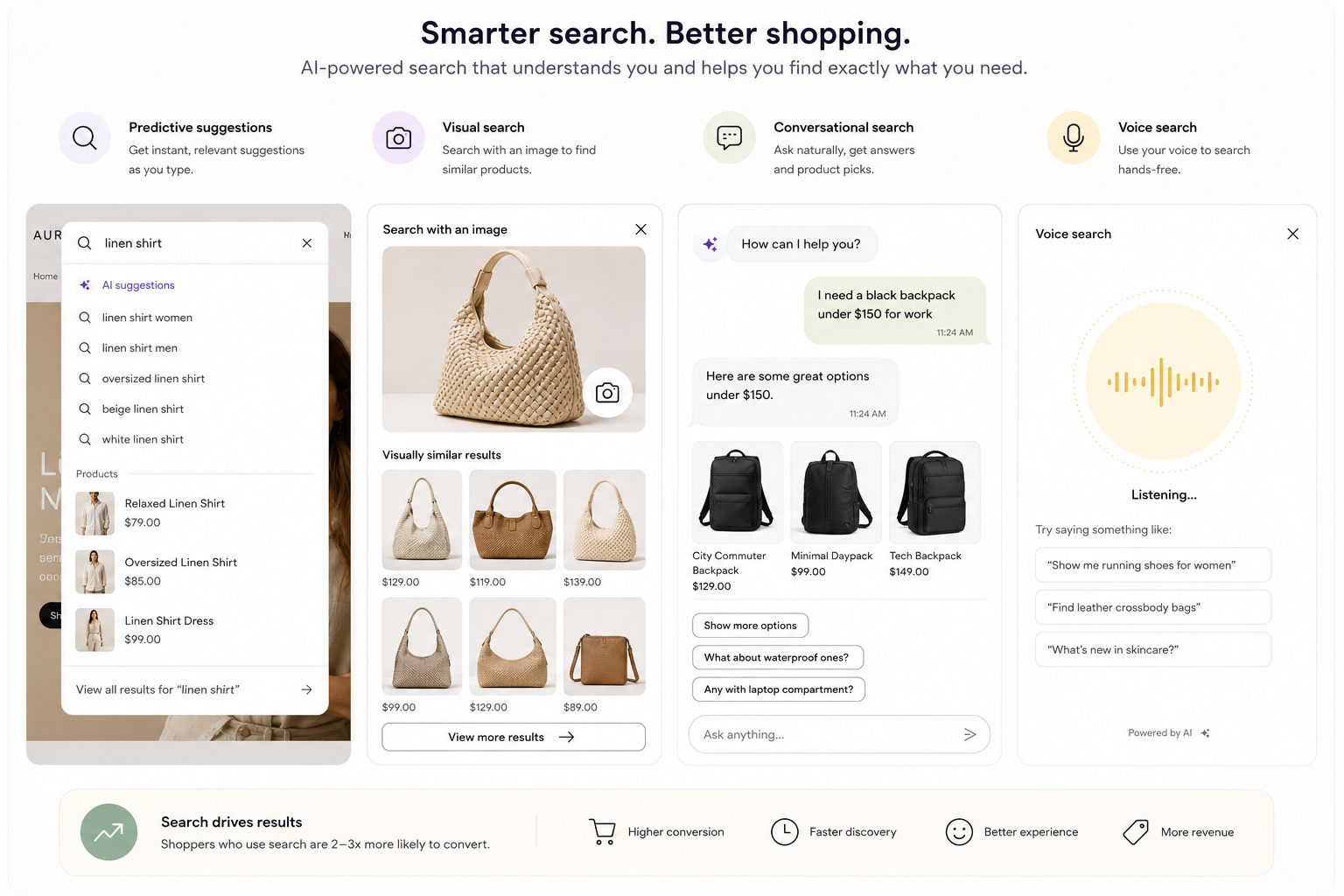
11. AI-powered and conversational search
What it is: Smarter on-site search with predictive suggestions, visual search and conversational or voice-driven product discovery.
Why it matters: Shoppers who use search convert at a much higher rate, so helping them find products fast pays off directly.
How to apply: Upgrade site search with autosuggest and filters first, then add visual or conversational search if your catalogue is large.
12. Sustainable, trust-focused and SEO-ready design
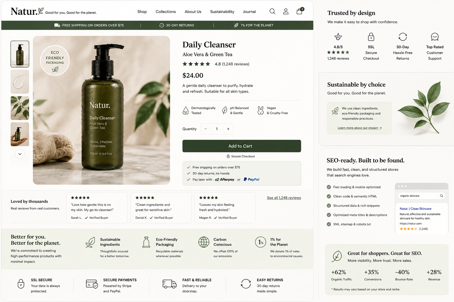
What it is: Design that signals credibility and values: security badges, genuine reviews, clear policies, eco-friendly messaging, and clean, fast, search-friendly code.
Why it matters: Trust drives the decision to buy, and an SEO-ready build means the store can actually be found. A beautiful store nobody can find, or nobody trusts, does not sell.
How to apply: Surface reviews and trust signals near the buy button, and build on fast, structured, SEO-ready foundations.
Which ecommerce design trends to prioritise (and which to adopt carefully)
Not every trend deserves equal budget. Lead with the ones that move conversion, and treat purely visual trends as accents.
|
Priority |
Trend |
Why |
|
High impact |
Mobile-first, frictionless checkout, fast performance, AI search |
Directly lift conversion and revenue |
|
Worth investing |
AI personalisation, social commerce, trust and SEO-ready design |
Compound gains over time |
|
Adopt carefully |
Bento grids, micro-interactions, scroll storytelling, bold typography |
Great for brand, but keep them from slowing the store |
|
Category-specific |
AR and 3D, immersive reveals |
High value for fit and look-driven products, optional for others |
How to apply these trends to your store
- Start with performance. A slow site undoes every visual trend, so speed and Core Web Vitals come first.
- Design mobile-first. Test every trend on a phone before desktop.
- Protect the path to purchase. Never let an animation or layout choice add friction to browsing or checkout.
- Use trends with intent. Adopt the ones that fit your product and audience, not all of them at once.
- Measure everything. A/B test changes and keep what lifts conversion. Small CRO wins compound.
Frequently asked questions
What is the biggest ecommerce web design trend in 2026?
AI-powered personalisation and mobile-first, thumb-friendly design lead the way, because both directly improve how easily shoppers find and buy products.
Do design trends actually increase sales?
The right ones do. Trends that improve speed, mobile experience, search and checkout lift conversion. Purely visual trends help branding but should never slow the store.
Should my store follow every trend?
No. Adopt the trends that fit your products and audience and that support conversion. Chasing every trend leads to a cluttered, slow site.
How often should I redesign for new trends?
Refresh key elements yearly and plan a fuller redesign every few years, or sooner if the store underperforms on mobile, speed or conversion.
Are these trends relevant for Singapore stores?
Yes. Singapore shoppers are heavily mobile and expect fast, trustworthy, well-designed stores with local payment options like PayNow.
Build a store that is on-trend and built to convert
Trends are only useful when they serve sales. If you want an online store that looks current and is engineered to convert, talk to MediaPlus Digital. Explore our ecommerce web design and WordPress ecommerce development services, and read our guide to the best ecommerce web design to see these principles in practice.