
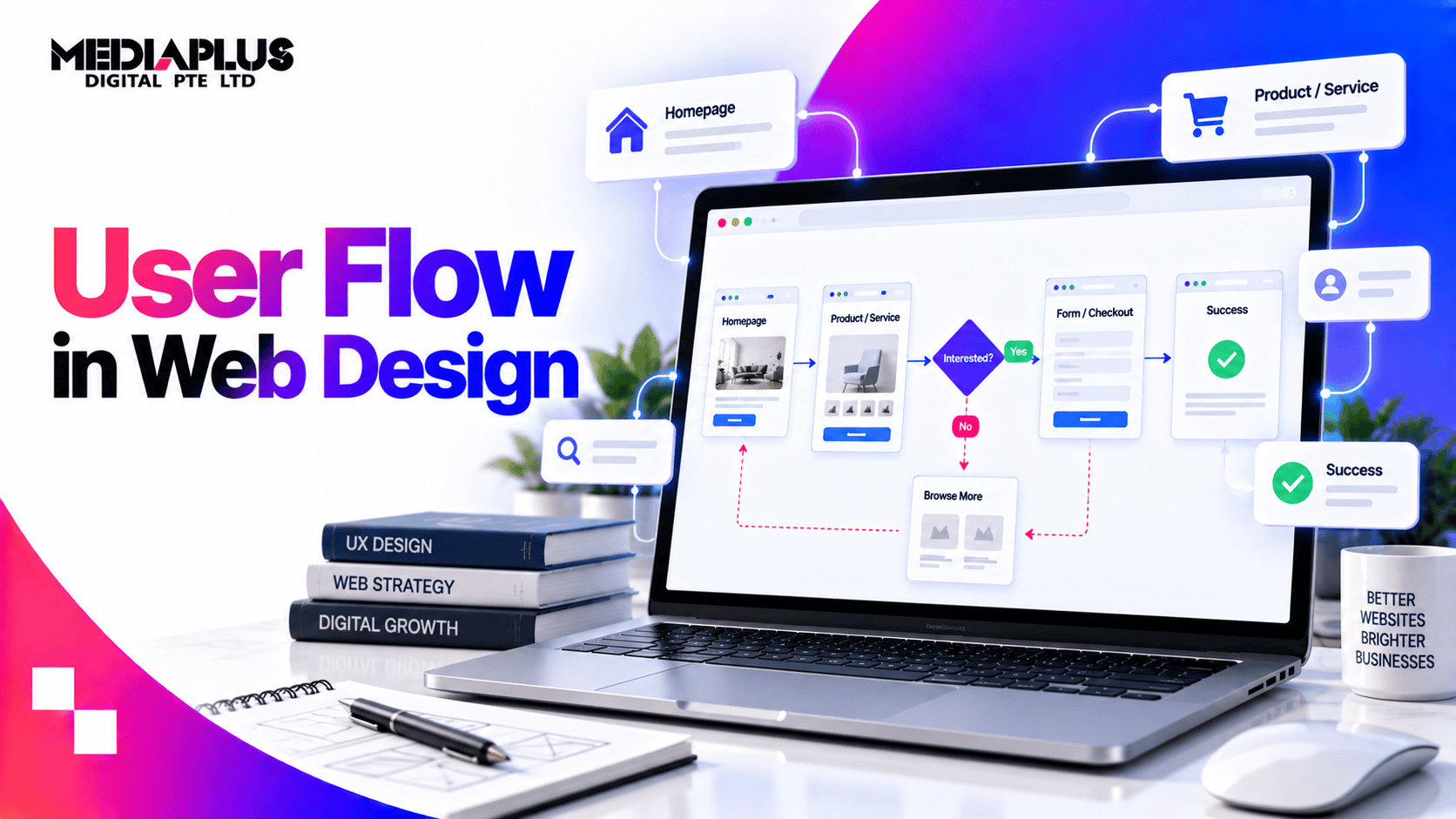
Quick answer
A user flow is the sequence of steps a visitor takes to complete one task on your website: find a service, request a quote, book an appointment, buy a product.
It is drawn as a diagram of screens and decisions, and it exists to answer one question before you build anything: what is the shortest honest path from arriving to converting, and where will people fall out of it?
Most websites do not have a user flow problem in the abstract. They have three specific drop-off points that nobody has looked at.
User flow, user journey and customer journey
These get used interchangeably and mean different things, which matters when someone asks you for one.
|
User flow |
User journey |
Customer journey |
|
|
Scope |
One task on the website |
One goal across sessions and channels |
The whole relationship, pre-purchase to repeat |
|
Timeframe |
Minutes |
Days to weeks |
Months to years |
|
Shows |
Screens, actions, decision points |
Stages, thoughts, frustrations |
Touchpoints, emotions, business processes |
|
Used by |
Designers and developers |
UX and marketing |
Marketing and management |
|
Output |
A diagram you can build from |
A map with insights |
A strategy document |
If a developer asks for a user flow and receives a customer journey map, nothing can be built from it. Our customer journey map guide covers the wider version.
What a user flow looks like
A flow is made of four things: entry points, screens, actions and decisions.
Written out, a simple service enquiry flow looks like this:
Entry: Google search “aircon servicing singapore”
↓
Landing: Service page
↓
Decision: Is the price visible?
├─ No → back to search results (drop-off)
└─ Yes → scrolls to packages
↓
Decision: Does a package match my unit count?
├─ No → leaves or uses chat (drop-off risk)
└─ Yes → clicks “Book now”
↓
Form: name, phone, address, preferred slot
↓
Decision: Too many fields?
├─ Yes → abandons (drop-off)
└─ No → submits
↓
Thank you page: what happens next, when we call
Every arrow that leaves the path is a place you are losing money. The job of the flow is to make those visible before you build the site, then to check them with data after launch.
Four flows worth having on file
Most Singapore business sites need one or two of these, not all four.
1. Lead generation flow
Goal: an enquiry from someone who can afford you.
Entry (search, ad, referral) → service page → proof section → pricing or pricing logic → enquiry form → thank you page with response time → confirmation email.
Where it breaks: no pricing signal, forms asking for company size and budget before any trust exists, a thank you page that says nothing about what happens next.
Design rules: one primary action per page, form fields kept to what you genuinely need to reply, and phone or WhatsApp as an alternative for people who will not fill forms.
2. Ecommerce purchase flow
Goal: a completed order.
Entry → category page → filters → product page → add to cart → cart → checkout → payment → confirmation.
Where it breaks: filters that return nothing, delivery cost revealed only at checkout, forced account creation, and payment methods that do not include what local shoppers use.
Design rules: show delivery cost and timing on the product page, allow guest checkout, and include PayNow if a meaningful share of your customers expect it. See how to reduce cart abandonment.
3. Booking flow
Goal: a confirmed appointment.
Entry → service or practitioner page → availability → slot selection → details → confirmation → reminder.
Where it breaks: availability that requires a call to check, calendars that only show this week, no reminder, no easy reschedule.
4. Research flow
Goal: a visitor who is not ready to buy comes back.
Entry (guide or blog post) → related content → comparison or pricing page → soft conversion such as a guide, checklist or newsletter → return visit → enquiry.
Where it breaks: blog posts that link nowhere, no soft conversion for people who are months away, and no path from content to the service page.
How to map a flow in six steps
- Name the task and who is doing it. “A facilities manager requesting a quote for six units” beats “a user”.
- List the entry points. Homepage, service page, blog post, Google Business Profile, ad, WhatsApp. Each starts the flow at a different point.
- Write the steps as actions, not page names. “Compares three packages” tells you more than “packages page”.
- Mark every decision where the visitor could leave, and be honest about why they would.
- Add what the person needs at each step: the price, the delivery time, the proof, the reassurance.
- Count the steps and remove one. There is almost always one you can remove.
Do this before wireframing, because the flow decides what pages need to exist. See wireframing for the next stage.
Finding where the flow actually breaks
Mapping is a hypothesis. These four sources tell you the truth.
|
Source |
What it shows |
What to look for |
|
GA4 funnel exploration |
Step-by-step drop-off for a defined path |
The single step with the biggest fall |
|
GA4 path exploration |
The routes people actually take |
Loops, backtracking, unexpected exits |
|
Session recordings and heatmaps |
Where people hesitate, rage-click, or stop scrolling |
Dead clicks on non-links, form field abandonment |
|
Search Console |
Which page they entered on |
Entry pages that do not match the flow you designed |
Two things to check first, because they are common and fixable:
- Mobile and desktop behave differently. A flow that works on desktop can bury the call to action on mobile after a long hero section.
- The form is where most lead generation flows die. Count the fields. Each one costs you completions, and most exist because someone in the business wanted the data, not because the reply needs it.
Fixing the four most common problems
|
Problem |
Usual cause |
Fix |
|
High drop-off on one step |
The step asks for more than the visitor is ready to give |
Move the ask later, or reduce what you ask for |
|
Visitors take unexpected paths |
Navigation labels use your internal language |
Rename to the words customers use |
|
People loop between pages |
The information they need is split across pages |
Consolidate onto one page |
|
Mobile converts far worse |
Long hero, small tap targets, slow forms |
Shorten above the fold, test on a real phone |
|
Traffic but no enquiries |
The page answers a different question from the search |
Match the page to the intent, not the keyword |
Measuring whether the change worked
Pick two or three numbers before you change anything, and measure the same ones after:
- Completion rate for the flow, from entry to conversion
- Drop-off rate at the step you changed
- Time to complete, when speed matters, such as checkout
- Enquiry quality, not just volume, because shorter forms can bring less qualified leads
- Mobile versus desktop, reported separately
Give it at least two to four weeks of comparable traffic, and avoid changing three things at once. Our guide to improving website conversion rate covers the testing side.
Tools
|
Tool |
Use it for |
|
Figma or FigJam |
Drawing the flow alongside wireframes |
|
Whimsical or Miro |
Fast collaborative flow diagrams |
|
GA4 funnel and path exploration |
Where people actually drop out |
|
Microsoft Clarity or Hotjar |
Recordings and heatmaps, free tiers available |
|
Pen and paper |
The first version, always |
Frequently asked questions
What is user flow in web design?
The sequence of screens, actions and decisions a visitor moves through to complete one task, such as requesting a quote or completing a purchase.
What is the difference between a user flow and a user journey?
A user flow covers one task on the website, usually minutes long, and is detailed enough to build from. A user journey covers a goal across sessions and channels and is used for strategy.
How do I create a user flow diagram?
Name the task, list entry points, write the steps as actions, mark the decision points where people can leave, note what they need at each step, then remove a step.
How many steps should a flow have?
As few as genuinely serve the visitor. For an enquiry, three to five. For checkout, three to four. Removing a step usually raises completion more than redesigning one.
Do I need user flows for a small website?
Map at least your main conversion path. Even a five-page site has one path that matters more than the rest.
How do I know my user flow is broken?
Look for a single step in GA4 with a much larger drop than the others, pages where people scroll then leave without clicking, and forms with high abandonment.
When should user flows be created in a project?
After the sitemap and before wireframes. The flow decides which pages need to exist and what each must contain.
Should mobile and desktop have different flows?
The steps should be the same. How they are laid out often differs, because what fits above the fold on a desktop does not fit on a phone.
Getting the path to conversion right
MediaPlus Digital maps conversion flows before design, then checks them against real behaviour after launch. Thirteen years in the Singapore market, a team of 60 and more than 1,800 projects delivered. One recent B2B client saw organic conversions rise 108% in six months once the paths into their key pages were rebuilt.
See our web design services in Singapore or our conversion rate optimisation service if the traffic is already arriving and not converting.